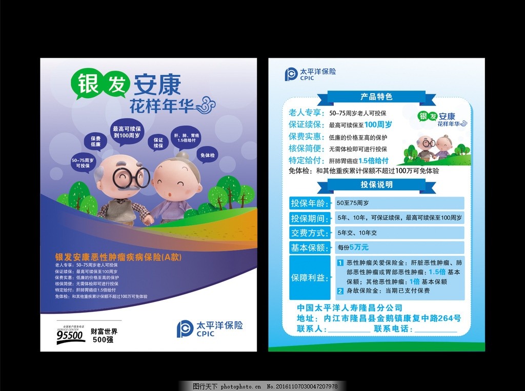
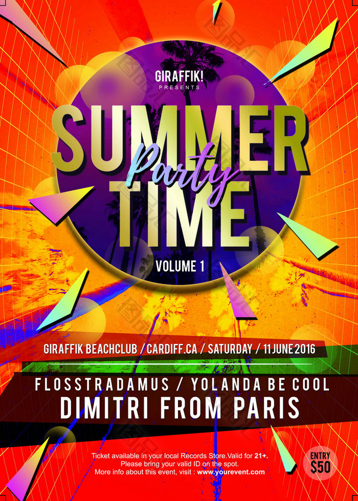
Colorful Advertising Flyers: The Ultimate Guide to Creating Effective English Handout Ads
Introduction
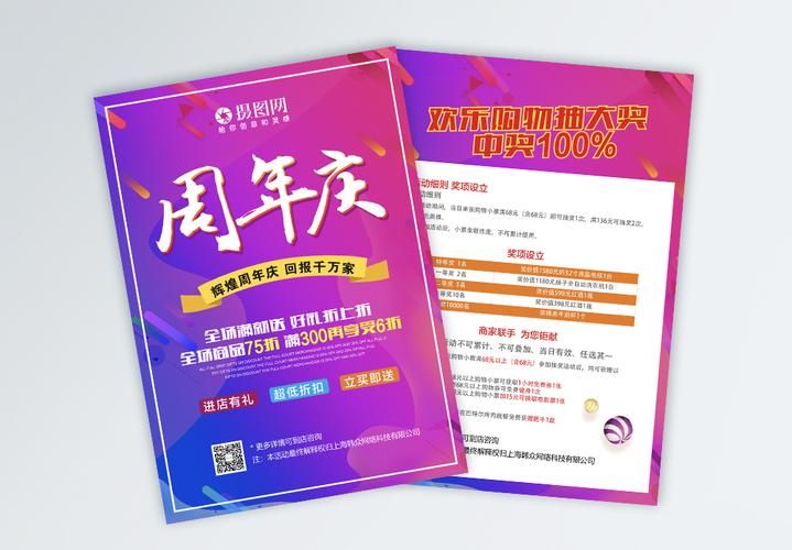
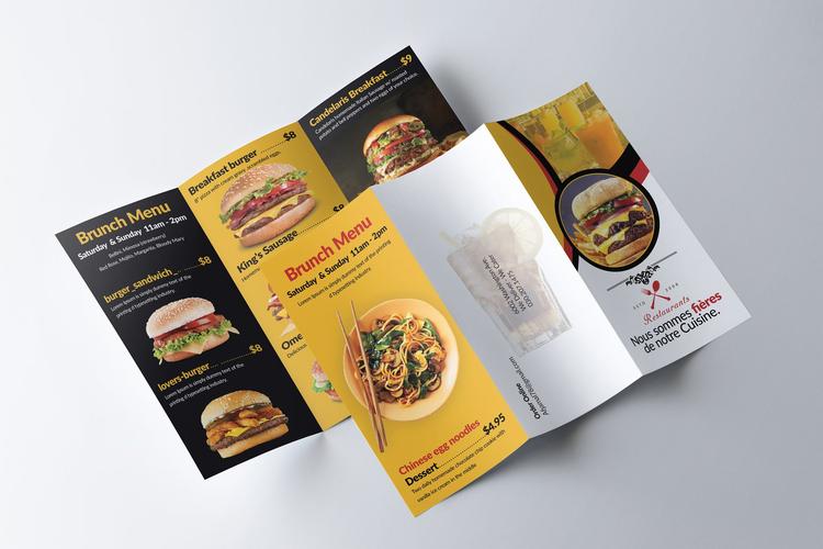
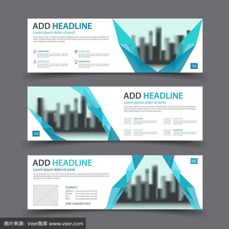
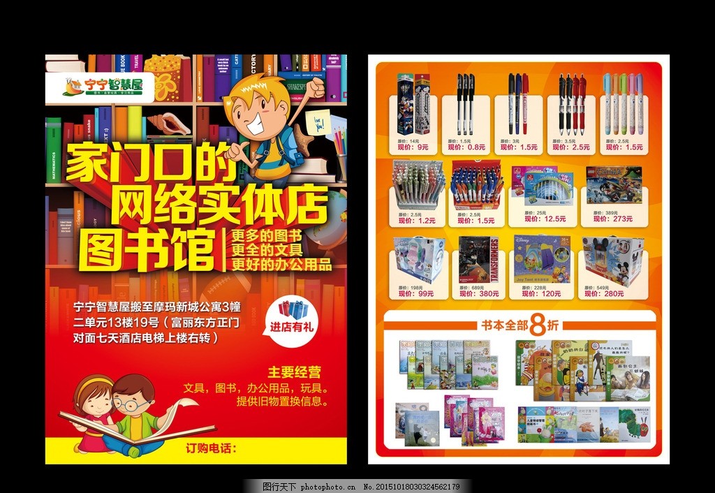
In today's competitive market, colorful advertising flyers remain one of the most cost-effective and versatile tools for promoting products, services, and events. A well-designed English handout ad can capture attention, communicate key messages quickly, and drive customer action. This guide explores the essentials of creating effective colorful advertising flyers in English, from design principles to copywriting strategies, and provides practical tips for maximizing your return on investment.
Why Colorful Flyers Work
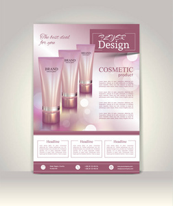
Color psychology plays a vital role in marketing. Bright, vibrant colors can evoke emotions, increase brand recall, and encourage impulse responses. Studies show that color increases brand recognition by up to 80%. For English-speaking audiences, certain colors carry specific connotations: red for urgency and excitement, blue for trust and professionalism, green for health and freshness, and yellow for optimism and caution. Using a strategic color palette ensures your flyer stands out while reinforcing your brand identity.
Key Elements of an Effective English Flyer Ad
A high-converting flyer typically includes the following components carefully arranged:
- Headline: A compelling, benefit-driven headline in large, bold typography (e.g., "Get 50% Off Your First Order!").
- Visual Hierarchy: Use size, color, and placement to guide the reader's eye from most important to least important information.
- Product/Service Image: High-quality, relevant imagery that immediately communicates your offering.
- Body Copy: Concise, scannable text that highlights key features and benefits, written in natural English.
- Call to Action (CTA): Clear directions on what to do next (e.g., "Call now," "Visit our website," "Show this flyer for 20% off").
- Contact Information: Phone number, website, social media handles, and physical address (if applicable).
- Offer Details: Any terms, conditions, or expiration dates.
Design Principles for Colorful Flyers
- Contrast and Readability: Ensure text is legible against the background. Dark text on a light background or vice versa; use contrasting colors for buttons and CTAs.
- White Space: Avoid clutter. Give your design room to breathe; white space improves comprehension and focus.
- Typography: Limit to 2-3 font families. Sans-serif fonts (e.g., Arial, Helvetica) are modern and easy to read; serif fonts (e.g., Times New Roman) convey tradition. Headings can be bolder; body text should be at least 10-12 pt.
- Color Balance: Use a dominant color (60%), secondary color (30%), and accent color (10%). This 60-30-10 rule creates visual harmony.
- Alignment and Margins: Keep consistent alignment and adequate margins (at least 0.25 inches) to avoid printing cut-off issues.
Copywriting Tips for English Flyers
- Keep it short and simple: Use short sentences and bullet points.
- Use active voice: "Save $50 today" instead of "$50 can be saved."
- Focus on benefits, not just features: "Enjoy a brighter smile" rather than "Contains whitening agents."
- Create urgency: "Limited time offer" or "Only 10 spots left."
- Speak directly to your audience: Use "you" and "your" to personalize the message.
- Proofread carefully: Spelling errors damage credibility, especially in English ads.
Distribution and Placement Strategies
- Hand out flyers in high-traffic areas (e.g., near your store, at events, in shopping centers).
- Include flyers in local newspapers or direct mail campaigns.
- Post them on community bulletin boards (with permission).
- Insert them in packages or bags for customers.
- Distribute at trade shows, conferences, and networking events.
- Use light box displays or place them on counters if allowed.
- Digital distribution: Share flyer images on social media and via email newsletters.
Measuring Effectiveness
To optimize your flyer campaigns:
- Include a unique QR code or custom URL to track responses.
- Use a dedicated phone number or promo code for flyer-only offers.
- Ask customers how they heard about you at point of sale.
- Monitor the number of flyers distributed vs. responses received.
- Gather feedback through short surveys.
Common Mistakes to Avoid
- Overcrowding the flyer with too much text or too many images.
- Using low-resolution images that look pixelated when printed.
- Ignoring print resolution: ensure at least 300 DPI images and CMYK color mode.
- Forgetting the call to action or making it too vague.
- Not leaving enough space for postage if mailing (check postal regulations).
- Printing on flimsy paper: choose at least 100 gsm for handheld use.
- Missing a meaningful reason to keep the �like size"
typo 我也懒得改了
Assialement.
如若转载,请注明出处:http://www.qittoys.com/product/1.html
更新时间:2026-10-26 05:02:17